Optus-My Optus App
Optus is a leading telecommunication company in Australia, which serves billions of customers every day with its network that covers 98.5% of Australia.
My Optus App as a central digital channel to support customers is a critical part of the brand experience and a central digital platform that supports our strategy to be a digital-first company.
Project overview
Optus has recently redefined its purpose to ‘Power optimism with options’. We need to uncover deep customer needs and values, and align them with the goals and direction of My Optus App to achieve Optus’ vision and purpose.
Project Background:
A service design team has worked on this project for the last sprint, and the former findings are shown on the left.
At the top of the hierarchy of needs, customers are looking for ‘yes moments’ and a ‘living network’.
Takeaway of ‘Living Network’:
Users are growing and changing along with the rapidly changed digital world. My Optus App needs to grow with them
My Role
UX Research, Meeting/Workshop facilitator Prototyping, Service Design, User testing, Information Architecture
Our Team
Madison, Ming, Amber, Christine, Uday
Tools
Google survey, Figma, Pen & Paper, Miro, Slack, Optimal Workshop
Timeframe
2 Weeks
Client meeting
Understanding the project, and Optus’ vision and mission. Updating discoveries with the client and receiving feedback
Talking to our client we understand Optus wants to have a deeper connection with the customers through My Optus App.
We drafted our survey and interview scripts based on our objectives. The project is very challenging and complex, so we
kept reflecting on findings everyday and redefining our objectives.
Survey Response:
43
1-1 Interview:
21
Survey Findings
-Only 18.6% participants open their telecommunication provider app frequently
-Telecommunication app is mostly used for:
Checking data usage - 47%
paying bills - 42%
What users are saying.
“I use my phone to plan my life”— Thy, 30
“My phone and social media keep me connected with friends and family”— Sap, 28
“I like clean and simple UI” --Gyongyi, 26
“I would delete an app if it got too many ads on it”--Manta, 33
“It's not easy to go through buying hoyts tickets” Thuy, 29
‘Optimism’ app experience:
“Having apps speak Text to each others, the adds are value to me” - Max, 28
“I want things specific to me on an app” - Josh H, 26
Based on our research, 90% of our survey responds are in the age group of 18-34
We interviewed 2 users whose age are over 40, they seem not very engaged in telecommunication app at all.
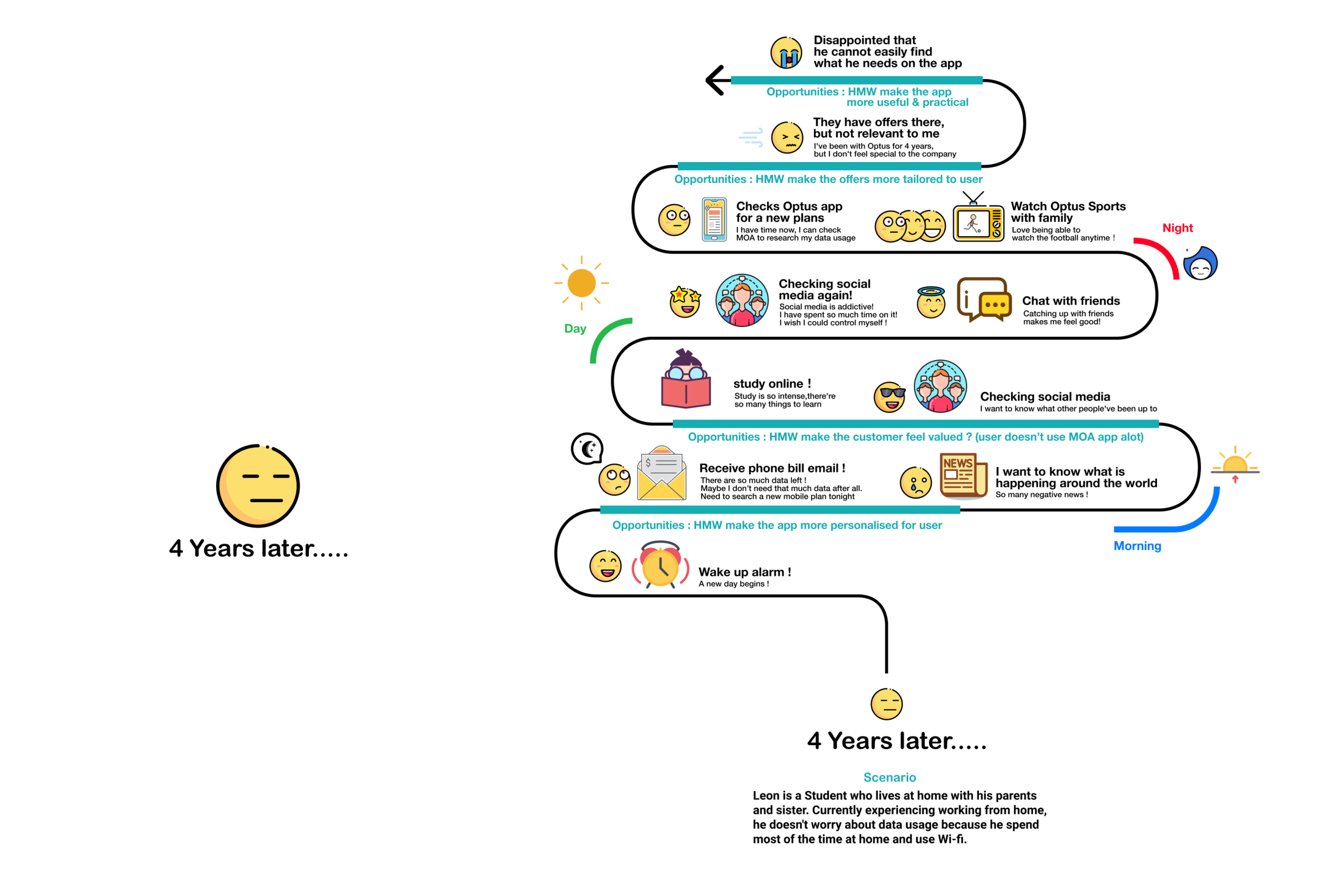
We defined our primary persona as below:
Leon is growing in these 4 years, but My Optus App is not used often and hasn’t been growing with him.
How Might We?
1, How might we make the app more useful and practical for Leon so he finds what he needs?
2, How might we make Leon feel valued so that he has a connection to My Optus App?
Ideation
Co-design Workshop with our client Lilian—>
Usability testing —Low-Fi
Gift feature:
· Personalise message for gifts, Ability to add from contacts,
· Explaining benefits users can get when purchasing in the app,
· Users want to make purchase for themselves
Home page:
· Explaining ‘customise features’ on home page,
· Removing Virtual Assistant as users don’t see the value in it,
· Add phone number to home screen
Sports:
· Ability to chat to people during the football games
Final UX Delivery
Learning Outcomes
Information Architecture
Information architecture is important, and there’re a few ways to test it. In this sprint we tried card sorting and prototyping.
Example from this sprint: Customise skin should be put in ‘more’ not on home page.
Area to improve
Usability testing is a good chance to test the AI. In the future, we can ask users whether they think this feature should be on this page, if not, where they think it should be.


